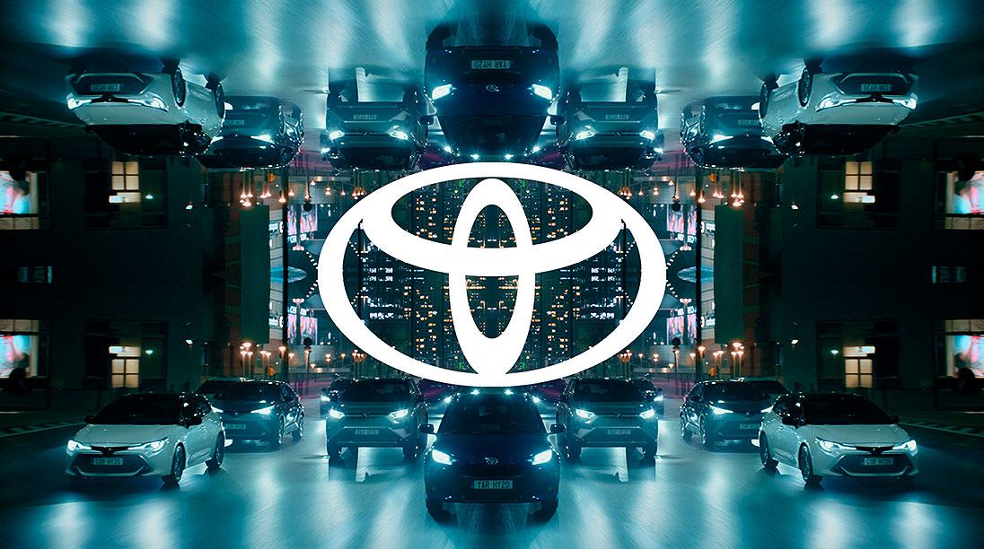
Toyota is the latest car-maker to launch a “flat” logo that eschews the three-dimensional, shadow-toned symbol used previously. The “Toyota” name has also been removed.
The company said the latest design stands for the transition to a mobility company and describes it as a new design language for “a mobility-first digital age which operates fluently across all digital and physical touchpoints.”
“The new logo will be applied across all communication touchpoints, while the current logo will continue to be used for Toyota vehicles,” Toyota said in a statement.
“The current retailer signage will also remain in place and will be reviewed in the Toyota 2025 Network Strategy.”
Toyota said that its new visual identity had been driven by simplification and has been shaped by four key principles: forward-thinking, mobile-ready, more premium feel and consistency across all business units and sub-brands.

The new logo was designed by international consultancy The&Partnership. Its head of design Dan Beckett said that the previous design, unchanged since 2009, was looking “tired” and needed to be more “premium”, “forward-facing” and better adapted to mobile platforms.
The flat logo will be used in Europe before being rolled out to other markets with the first showing at the European launch of the latest Yaris hatchback.
Toyota’s logo change comes after Nissan, Volkswagen and BMW also made changes.
For Toyota, it comes along with some name changes to business arms. In Europe, Toyota Insurance Management is now renamed Toyota Insurance Services as its business expands with the growth of connected services and new mobility products.
In used cars, Toyota Plus becomes Toyota Approved Used.
Late in 2019 in the UK, Toyota bought the fleet business of Inchcape. It then rebranded Inchcape Fleet Solutions as the Kinto personal mobility brand, as it looks to “transition from being a car manufacturer to a mobility company”.
BMW’s new logo is being rolled out globally from March 2020 through to the end of May 2021. It will be used for all online and offline communications, as well as international trade fairs and events.
BMW said it will not completely replace the existing logo which will instead co-exist alongside the original.

In a statement, it said the new logo “is a new media branding and will be used in addition to the existing logo.”
“It won’t be used on the vehicles or in the exterior and interior labeling our dealerships, where the existing logo remains in use.”
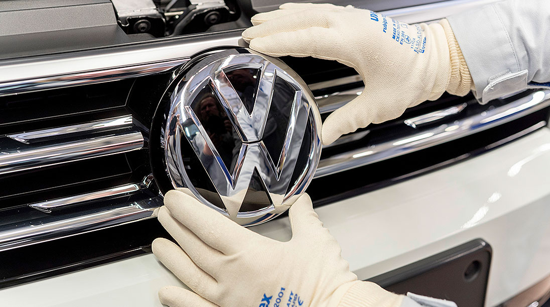
Volkswagen announced its new simplified logo late last year. The company’s chief marketing officer, Jochen Sengpiehl, said: “We have created a new holistic global brand experience on all channels and across all touch points.”
“As a general principle, the aim in future will not be to show a perfect advertising world. In our presentation, we want to become more human and more lively, to adopt the customer’s perspective to a greater extent and to tell authentic stories.”

Volkswagen did not use external agencies for the initial design, preferring to conduct a program with its joint team of design and marketing departments. It is used for corporate communication and will extend to dealerships and vehicles. The first car with the logoi is the ID.3 EV that was launched this month.
Nissan last month showed its new logo that aims to launch the brand into a new generation of models and specifically a move towards digital connectivity and electric mobility.
The open-sided circle with the Nissan name in a new script will begin to be used later this month and will first appear on the Ariya EV, the brand’s first crossover electric model.
It replaces a more modest logo that Nissan has used for the past 20 years.

By Neil Dowling


 Read More: Related articles

